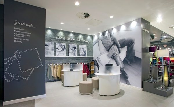
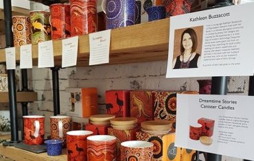
The retail industry is going through a revolution, or should I say evolution, so whether you are thinking of opening a store or looking to make some updates to an existing fitout, here are some simple guidelines you might like to consider when planning your retail store.
1 Let there be light
Without the proper light the merchandise cannot be seen or judged, colours cannot be appreciated, coordinates cannot be assembled, nor buying decisions made. Let your light be the best you can afford to install and use or, if necessary, skimp on something else and put the extra money into your lighting system.
2 Invest in good store design and fixtures
Let the look of your store reflect your fashion image, the quality of your merchandise and the class or target market you hope to attract. Do not aim too far above your customers’ expectations or sink to their lowest denominator, but rather be the very best you can be for who you are, what you sell and to whom you are selling.
3 Create a comfortable and inviting ambience
Make your store customer friendly. Make entering irresistible; make it comfortable to be in and pleasant to move around in. Keep it warm—but not too warm in winter, and cool—but not too cold in the summer. Remember that the customer is the guest you have invited into your house of business, so make her or him feel welcome and wanted.
4 Have effective visual merchandising
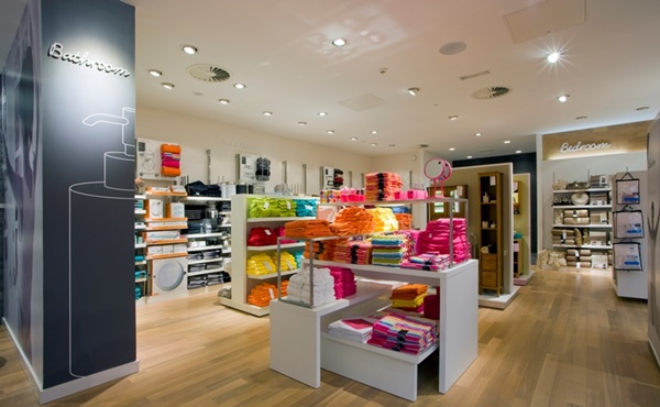
Show your merchandise in simple, clearly presented, easy to grasp and easy to shop situations. Take the confusion out of shopping by merchandising either by colour, by category, by size or by price. Whatever your store’s specialty is—cluster your products either by size, category or whatever—but do show them in colour-coordinated clusters.
Tell ‘colour stories’. This not only helps to make the product easier for the shopper to see and understand, but also helps to make the whole selling space seem neater and more organised. Do whatever you do from the shopper’s point of view—and viewing. See the store as he or she sees it and help your shopper quickly and easily find what he or she is looking for.
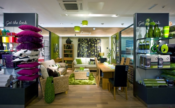
5 Use displays to animate the store
Use displays within the store to indicate where product types are stocked and show how the products can be worn, used, coordinated and/or accessorised. It is ‘show and sell’ time and an opportunity to give form and dimension to merchandise that is either neatly folded and stacked or limply hung on hangers. Add props and decorative accessories for seasonal accents or to promote lifestyle usages. Highlight the displays with good, strong, flattering light and then surround them with the stock for the shopper’s selection.
Displays can act as focal points to break up the traffic movement in the store, provide visual entertainment stops where new products are introduced, and make sure that the shopper gets full exposure to the complete range. Displays can lead shoppers throughout the store.
6 Select light and texture over colour and pattern for the environment
Avoid strong patterns and overwhelming colours on walls and floors and near your presentation of products. Rather, depend upon light and textured materials for interest and contrast. Keep the strong accent colours for special areas, or for special occasions like seasonal changes or holiday promotions. Use them on focal walls to dramatize display settings, a unique piece of furniture or a fixture. Colours can be used to ‘alter’ the physical space―warm or hot colours bring the walls into the space and seem to lower the ceiling while the cool colours can ‘push’ back the walls and raise the ceiling.
7 Do not minimise the importance of the dressing room
If your store sells clothes as well and has a dressing room, make sure to do it right. The dressing room or try-on room is ‘the moment of truth’. It is here, in front of a mirror, where the purchase is actually made. Make your dressing room as spacious and as comfortable as you can afford to make it, and be sure that it is suitable for your particular customer.Different age groups and different types of merchandise require different kinds of dressing rooms—and even the spaces may vary.
Whether the mirror is in the dressing room or just outside it, be sure you illuminate the mirror’s surface with the best and most flattering light. Not only do you want to enhance the color of the garment but—even more—you need to flatter the shopper in the garment. If she glows—the garment goes with her. It is a sale!
8 Provide proper amenities
Simple amenities are today’s necessities. Little things do mean a lot to a shopper in a hurry and looking for comfort along with quality. What was once an extra nice touch is today expected to be part of the shopping experience. Seating should be available for tired shoppers as well as those who must patiently wait out the trying-on process. Make the waiting visitor—especially a male one—comfortable and welcome by providing something to occupy his time—magazines and newspapers to read, TV to watch, a cup of coffee or a glass of wine.
Mothers with small children pulling on their arms are more likely to shop less than one who knows that her children are safe nearby watching TV or happily playing while being supervised by a responsible store attendant. It is also easier and more conducive to shopping when the shopper is unencumbered with parcels and heavy outerwear. Consider the possibility of offering some sort of checking or storage facilities. Since your shopper is your guest—treat him or her like one.
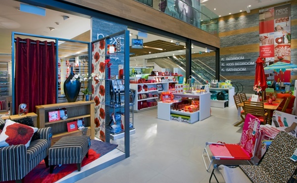
9 Entertain the customer—but properly
Entertainment! What could be a pleasant and relaxing entertainment for one segment of the buying public can be a nerve-shattering experience for another. Music is fine but tune into what your target market’s preference is, and at what decibel he or she likes to hear that music. If your store’s clientele really runs the gamut, either find a happy in-between or just keep it down to soft, soothing new wave music—or just blissful silence.
TV monitors make great entertainment—or they can be totally exasperating. Again, what appeals to your target market—your customers? This includes what is played, where it is played and at what level of sound. To paraphrase the great showman Phineas T. Barnum, ‘you can’t please all of the people all of the time’, so know your strengths and go with them. Remember, silence can be golden.
A small café or bar tucked into a corner of a retail store can be entertainment—and a blessing. It can be a place where shoppers can refresh body and soul, meet friends, relax and build up for another bout of shopping. The longer the shopper stays in the store, the longer he or she is exposed to the merchandise and thus the longer they will shop.
10 Service is a must
The oldest and the newest trend in shopping is service. Customers value their time and their efforts. They don’t want to have to wander aimlessly in a store hoping to find what they want or need. They want service.
Service can be a human that greets them and offers help and/or guidance. It puts a face and a voice to the store’s image and takes some of the confusion out of the shopping process.
Service can be offered with easy-to-read, easy-to-follow signage that gets the shopper through the space and culminates in a successful purchase. Service can be and should be found at the check-outs or cash wrap desks. These should be easy to locate and the cashiers should make the purchase procedure a fast and pleasant experience.
More sales are lost in the check-out lines because of the long waits, delays and inefficient service than in the dressing rooms where a garment is tried on. This final step is the ultimate test of the retailer’s concern for his customers. It is the last movement of the shopping symphony. It is what the shopper remembers and will affect her return to the store for an encore visit. Credits, return policies and follow-ups after purchases also make up service—and the store’s image.
Interaction is a new buzz word in retailing. Shoppers interacting with the merchandise. The best form of interaction in the retail store is the interaction between two humans in the store: shopper and retailer.
Photos: NEXT HOME, Cambridge UK. Designed by Dalziel + Pow, London. Photographer: Andrew Townsend.
Martin M Pegler is an author, editor, educator and lecturer, and has been a professor at the Fashion Institute of Technology in NY for over 30 years. He has worked with the IHA Global Innovation Awards (gia) from the beginning of the gia program in 2000, as an expert juror, and since 2016 as an honourary member of the gia expert jury. www.housewares.org/show/gia-retail.
innovation, design, trends + inspiration from the International Housewares Association (IHA) and the International Home + Housewares Show – www.housewares.org, the show starts this Saturday 10 March.


