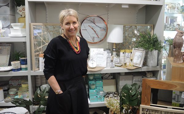
Jo Morris, owner of home and kitchenware store The Gymea Lilly in Sydney’s Sutherland Shire, has been involved in retail for 25 years. Here, she shares her top visual merchandising tips for creating an inviting space. The key? Treat your store like it’s a board game.
1. Prime position
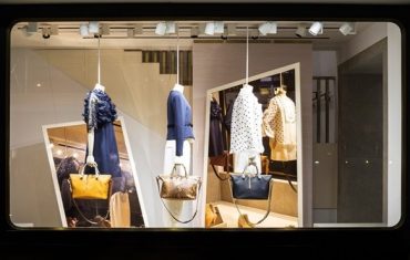
I look at our shop as a Monopoly board. The window is Mayfair—that’s your prime real estate, where your good stuff has to be. We do our windows at least once a fortnight, and we put in a big effort because people love it. Down on the ground is something that doesn’t get asked for very often, so that’s Old Kent Road. Eye level is also really important because people don’t always look up and they don’t look down.
2. Theme it
You want the shop to have a certain theme about it, that’s how you get your look. [When buying] I try and theme the shop for a season. For instance I think, “Ok there’s going to be a lot of lemons and blues coming through”, so I try and think of the whole shop with those in mind—I don’t then go and buy a whole range of red and black stuff.
3. In style
Style your displays. You need to make the products look like they could be in someone’s home. Work in threes, I’m sure everybody knows that. And don’t clutter—that’s a big one.
4. Know your audience
I know that around here people like coastal. The coastal theme will change from one year to another but they like that type of look. If I got red and black in, it might sell in [neighbouring suburb] Kogarah but it won’t sell here.
5. Go green
Greenery in your store is really important at the moment—bringing the outside in with plants.


