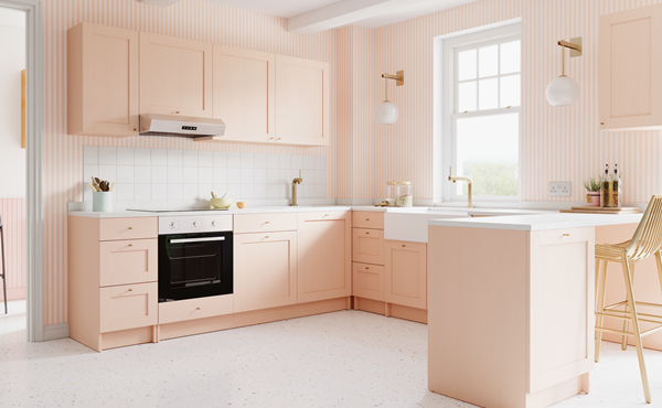
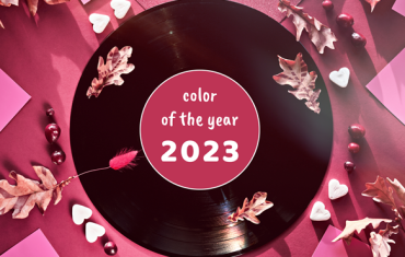
It’s official―Pantone has announced that their pick for colour of the year 2024 is Peach Fuzz.
Described by the Pantone Colour Institute as a comforting hue ‘softly nestled between pink and orange’ that was chosen to express a yearning for community and cosiness during uncertain times.
“In seeking a hue that echoes our innate yearning for closeness and connection, we chose a colour radiant with warmth and modern elegance,” explains Leatrice Eiseman, executive director, Pantone Colour Institute.
“A shade that resonates with compassion, offers a tactile embrace and effortlessly bridges the youthful with the timeless.”
At a time of turmoil in many aspects of our lives, our need for nurturing, empathy and compassion grows ever stronger as does our imaginings of a more peaceful future, adds Laurie Pressman, vice president, Pantone Colour Institute.
“The colour we selected to be our Pantone Colour of the Year 2024 needed to express our desire to want to be close to those we love and the joy we get when allowing ourselves to tune into who we are and just savour a moment of quiet time alone,” she says.
“It needed to be a colour whose warm and welcoming embrace conveyed a message of compassion and empathy. One that was nurturing and whose cozy sensibility brought people together and elicited a feeling of tactility. One that reflected our feeling for days that seemed simpler but at the same time has been rephrased to display a more contemporary ambiance. One whose gentle lightness and airy presence lifts us into the future.”
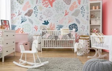
When it comes to interior design and home décor, Peach Fuzz creates a welcoming ambiance. Promoting feelings of gentle warmth whether appearing on a painted wall, in home décor or acting as an accent within a pattern, Fuzz infuses our most personalised worlds with a comforting presence.
“The colour we select to be our Pantone Colour of the Year is bigger than one region or one sector of design. It is a colour we see crossing all areas of design—a colour that serves as an expression of a mood and an attitude on the part of consumers, a colour that will resonate around the world, a colour that reflects what people are looking for, a colour that can hope to answer what people feel they need,” Pressman says.
“That’s the difference between a more short-lived fad and a lifestyle trend. Pantone Colour of the Year is reflective of a lifestyle trend. It’s about what’s happening in the zeitgeist at a macro level. It’s not going to represent a singular trend that you can only find in the US or only find in Asia. It’s global.”


