

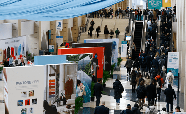
As consumers around the world continue their search for balance and beauty in their homes and lives, colour expert Leatrice (Lee) Eiseman explained to The Inspired Home Show 2025 attendees the reasons why ‘Welcome Home’ was selected as the theme of the Pantone View Home + Interiors 2026 forecast.
“These are two words, when used together, that express the most deep-seated and intrinsic human needs,” the executive director of the Pantone Colour Institute said.
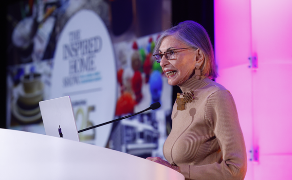
“It’s a theme that’s highly relatable and well understood, as a welcoming home provides the roof over our heads, whether it be a condo in the city, an expansive loft that has reminders of its industrial origins or the relaxed elegance of a country cottage with a revisit to not so shabby chic.”
The 2026 colour trends will be deeply rooted in the past, according to Eiseman, with a mixing of different eras while the palettes are also heavily influenced by the 2025 Pantone Colour of the Year, Mocha Mousse.
“If you can get a colour to evoke an emotion that involves the senses and you involve more than one sense, it really captures the human eye.
“The home needs to provide a functional and organised workspace for us to live within, but also for us to make a living in,” she said, offering a variety of palette options for different lifestyles and play styles.
The seven home palettes for 2026 are:
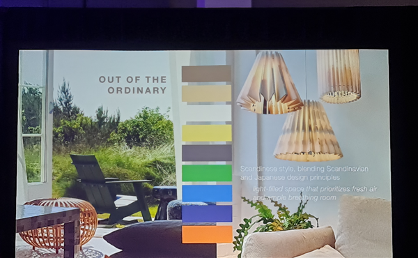
• Out of the ordinary—Eiseman calls this ‘Scandinese style’, blending time-honoured Scandinavian and Japanese design principles. The palette includes familiar neutral colours with a few warmer ones that are out of the ordinary to represent the imperfect beauty of nature. This palette embraces homeostasis, where a balance of warmth and coolness helps to regulate the temperature of the person living within that environment.
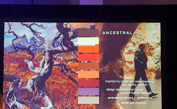
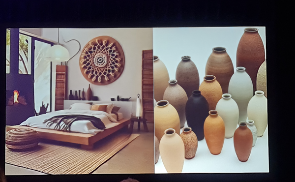
• Ancestral—this palette is designed to remind people of our human heritage—think caves and early native dwellings with raw, earthy warmth. This palette largely has warm colours, with some cooler ones like neutral grey and is a warmer alternative to black and white.
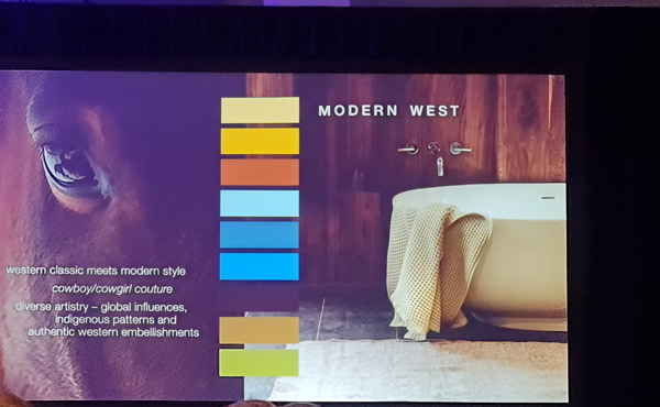
• Modern west—this is where western classic meets modern style and cowboy/cowgirl couture. Browns are balanced by green, a neutral colour in nature. Global influences from countries like Argentina, Australia and the Czech Republic add some brightness with turquoise. This palette is also influenced by indigenous patterns and authentic western embellishments.
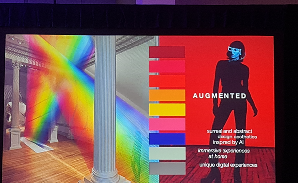
• Augmented—in this palette, surreal and abstract design is inspired by AI as well as immersive and digital experiences. This is a vibrant combination of reds, pinks, oranges and yellows, with blue and grey to balance the brightness.
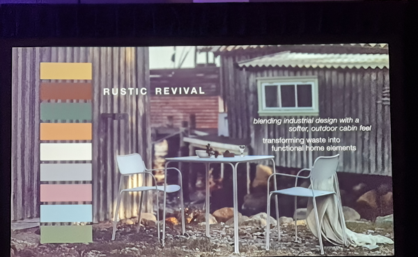
• Rustic revival—this is all about sustainability and industrial design with a softer, outdoor cabin feel. It’s a muted, subtle palette with sienna and grey tones that represent transforming waste into functional home elements.
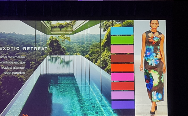
• Exotic retreat—Eiseman says this palette is perhaps the most fun. It touts nature’s maximalism with vibrant colours and is a beautiful balance of cools and warms including fuchsia, purples and browns. With tropical glamour meeting boho paradise, it helps to bring vacation colour and design back home.
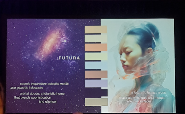
• Futura—inspired by the cosmos with celestial motifs and galactic influences, Futura is minimalist and high tech. But it’s not cool like you might think, said Eiseman. There are nuances of colour that add a bit of warmth.


