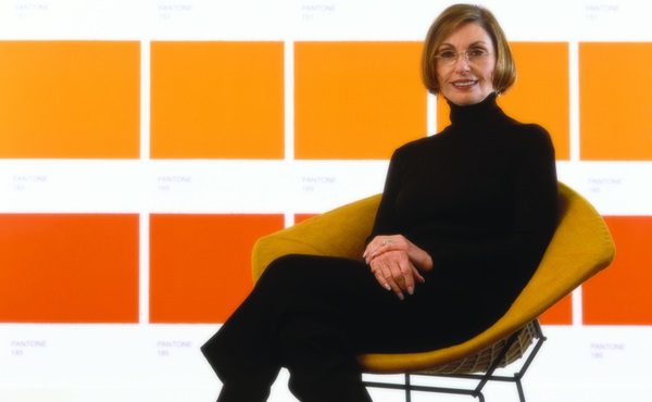
When design decisions are being made, the question arises about the right colour direction to take. This year the challenge is as great as ever, says colour expert Lee Eiseman, as we are at a crossroads. With the consumer’s constant desire to see something new continuing to influence colour/design trends, the question becomes what path will best drive success and consumer satisfaction? Eiseman discusses nine distinctive signposts leading to specific colour palettes that will help you meet customers’ demand.
1 Native Instincts
At one point in time, the term native applied to a specific indigenous culture. However, style-wise, current and future forecasts point to a homogenous mix of design and colour where a piece of Native American pottery is quite compatible with a Turkish kilim carpet and/or a Columbian artefact. This palette includes earthy tones such as neutral tan, copper metallic, bright gold and warm brown.
2 Florabundant
This palette is filled with rich floral hues, says Eiseman. As in most floral arrangements, as well as in natural settings, varying shades of green provide the perfect complementary background to the more vibrant tones in the palette which includes Pink Yarrow, Chrysanthemum, Red Dahlia and Baton Rouge along with Scarlet Ibis, a deep purple Winter Bloom and the metallic shade of Rich Gold.
3 Acquired Taste
In both food and surroundings, an acquired taste means an appreciation for the unusual, the unique, or the distinctively different. In terms of colour this mean a mixture of colours and/or textures that are not commonly seen together such as Orange Chiffon, Amberlight, Etruscan Red, Pale Gold, Mulberry and Branded Melon.
4 Day Dreaming
In the demanding world which we live in, this palette can fulfil its literal meaning as a ‘series of pleasant thoughts that distract our attention from the present’. The colours that evoke those thoughts are often light and seemingly weightless, as if to relieve the heaviness of day-to-day stresses and include Serenity Blue, Blue Glow, Plein Air and a Nile Green contrasted with 2016 Pantone colour Rose Quartz and Yellow Iris. A creamy beige and off-white are the necessary neutrals finished by a silver metallic.
5 Forest Bathing
Encouraging a healthy lifestyle is a stress reducing palette inspired by the Japanese practice of Shinrin-yoku or Forest Bathing. Studies have shown that a contemplative walk in the woods that reconnects a person with nature or, at the very least, surrounding oneself with greenery, is relaxing and restorative, elevating our mood. This palette includes several shades of green and blue-green such as Willow Bough, Moss, Silt Green and Hydro.
6 Raw Materials
The ongoing dedication to the reuse and repurposing of materials from nature and industrial resources plays a big part, as does the health and wellness movement. Colours include various grey tones, light and dark, Oil Yellow, Faded Denim, Guacamole, Winter Twig, Argyle Purple and Zephyr Pink.
7 Graphic Imprints
This palette, says Eiseman, starts in black and white, often shaded with grey. Contours, geometric shapes and texture add dimension. Colours include Blazing Yellow, Dazzling Blue, Prism Pink, Fandango Pink, Opaline Green and Orange Popsicle.
8 Reminiscence
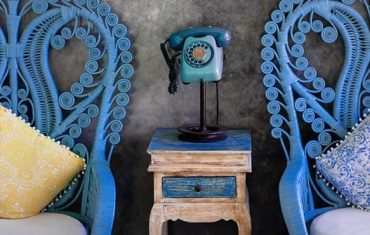
Providing a sense of nostalgia and stability in this age of digital innovations, this palette includes shades such as Maritime Blue, Sepia Tint, Dusty Blue, Rattan and Parchment. For a modern update these colours are mixed with a murky Martini olive and Bird’s Egg Green, or Sugar Almond and Valiant Poppy.
9 At Ease
This palette is the essence of subtlety. A variety of neutrals both cool and warm blended with muted tones, the colours are arranged in a way that seems effortless. Shades include the lavender grey Sea Fog, Orchid Haze, Twilight Mauve, Warm Sand, Zen Blue and Sea Angel.
By Marion Gerritsen
