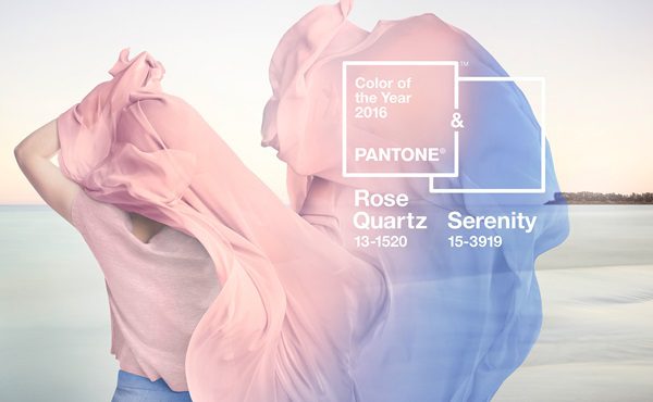
For the first time, Pantone has chosen the blending of two shades—rose quartz and serenity—as its colour of the year.
To select the perfect colour, the Pantone Colour Institute team search the world for influences, looking at everything from films to popular travel destinations, socioeconomic conditions and all areas of design.
According to Leatrice Eiseman, executive director of the Pantone Colour Institute, the choice for 2016 was inspired by consumers focusing on mindfulness and well-being as an antidote to modern day stresses, and warm colours that reflect reassurance and security becoming more prominent.
“With the whole greater than its individual parts, joined together serenity and rose quartz demonstrate an inherent balance between a warmer embracing rose tone and the cooler tranquil blue, reflecting connection and wellness as well as a soothing sense of order and peace,” she says.
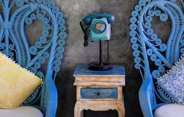
In interiors, Eiseman says the pairing brings a feeling of calm and relaxation into the home. Both rose quartz and serenity will work well for rugs and upholstery, as well as in paint and for decorative accessories. Pantone recommends pairing solid and patterned fabrics, throws, pillows and bedding in the shades to create a feeling of respite and well-being.
Consumers that don’t want to go all in with the trend by painting a wall or investing in a rug can try serenity and rose quartz coloured kitchen and tableware, candles and vases in translucent, glazing, matte and metallic shine finishes for subtle colour accents.
Previous Pantone colours of the year include 2015’s hotly-debated Marsala, radiant orchid in 2014 and emerald in 2013.
By Ruth Cooper


