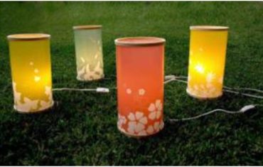
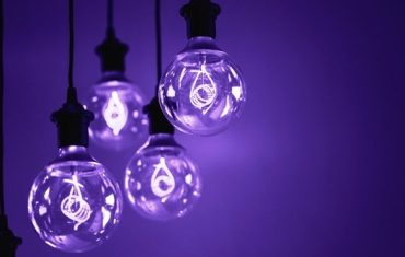
Pantone has launched Ultra Violet as the 2018 colour of the year. A dramatically provocative and thoughtful purple shade, it communicates originality, ingenuity, and visionary thinking that points us toward the future.
Australian interiors are well placed to embrace this enigmatic colour as it complements our already established colour palettes.
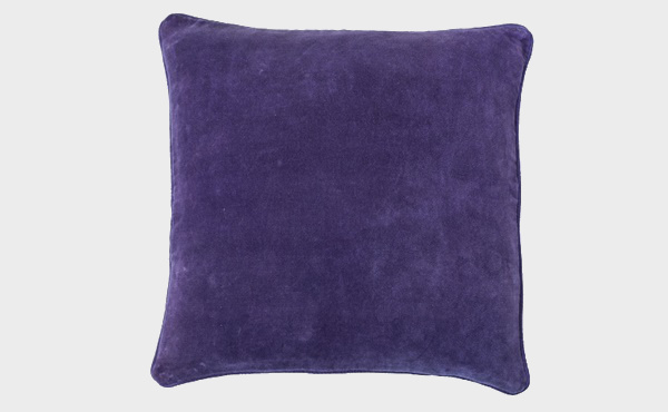
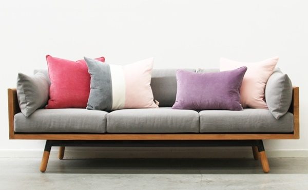
Our love of all things Scandi, where pale and dark greys dominate, provides a visually lovely base for ultra violet. In many of our homes, where black is the new black, ultra violet aesthetically works in well. And for those who favour a coastal inspired white and timber colour scheme, ultra violet can be introduced here too without visually unbalancing the space.
Interior designers and retailers introduce this not so shrinking violet colour into Australian interiors as subtle highlights. Add dining chairs, such as Satara’s Carbo chairs to timber tables, add scatter cushions such as its Lynette to grey sofas, introduce an ultra violet pop to established pale and bolder pink bedrooms or interiors. This shade can also be partnered with pale and darker blues to stunning effect.
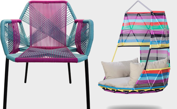
And if all else fails, take inspiration from nature. Satara’s magnificent and currently blooming Jacaranda trees lead the way. As we head into summer their purple flowers sway majestically against the greyish green leaves and mid to dark timber trunks.


