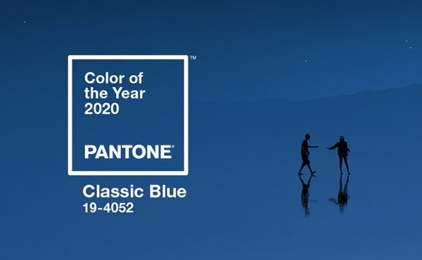
In a sign of the times, Pantone has gone for timelessness and simplicity, choosing Classic Blue as its colour of the year 2020.
The Pantone Colour of the Year highlights the relationship between trends in colour and what is taking place in our global culture at a moment in time, says Laurie Pressman, vice president of the Pantone Colour Institute.
“It’s a colour that reflects what individuals feel they need that colour can hope to answer,” she says.
“As society continues to recognise colour as a critical form of communication, and a way to express and affect ideas and emotions, designers and brands should feel inspired to use colour to engage and connect.
“The Pantone Colour of the Year selection provides strategic direction for the world of trend and design, reflecting the Pantone Colour Institute’s year-round work doing the same for designers and brands.”
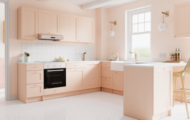
Offering the promise of protection Classic Blue is a pervasive favourite for home. Creating a stable foundation from which to build, Classic Blue injects creative confidence into interiors, transforming a space through unique colour combinations and tonal statements.
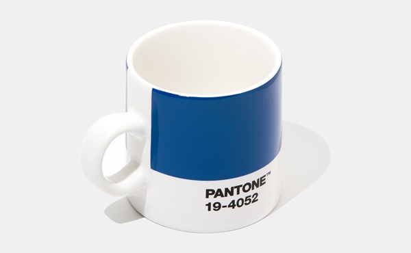
Easily applied across so many different materials, textures and finishes, Classic Blue is a dependable blue that can take you in different directions expressing tradition and elegance as well as unexpected boldness.
The colour highlights our desire for a dependable and stable foundation from which to build as we cross the threshold into a new era, adds Leatrice (Lee) Eiseman, executive director of the Pantone Colour Institute.
“We are living in a time that requires trust and faith,” she says.
“It is this kind of constancy and confidence that is expressed by Pantone 19-4052 Classic Blue, a solid and dependable blue hue we can always rely on.
“Imbued with a deep resonance, Classic Blue provides an anchoring foundation. A boundless blue evocative of the vast and infinite evening sky, Classic Blue encourages us to look beyond the obvious to expand our thinking; challenging us to think more deeply, increase our perspective and open the flow of communication,” she adds.
To fully bring to life the true meaning of Classic Blue, Pantone has translated the colour into a multisensory experience. By extending the sensory reach of Classic Blue, Pantone is hoping to reach a greater diversity of people to provide everyone with an opportunity to engage with the Colour of the Year 2020 in their own unique way.
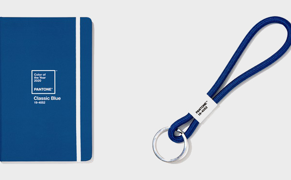
“As we all head into a new era, we wanted to challenge ourselves to find inspiration from new sources that not only evolve our Colour of the Year platform, but also help our global audiences achieve richer and more rewarding colour experiences,” adds Pressman.
“This desire, combined with the emotional properties of Classic Blue, motivated us to expand beyond the visual, to bring the 2020 Pantone Colour of the Year to life through a multisensory experience.”


