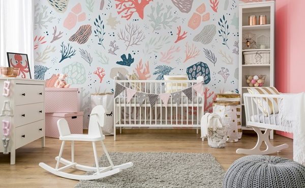
Warm, positive and at the same time expressive and intriguing. The Pantone 2019 colour of the year is a combination of juicy tangerine with a delicate, soft peach. It sounds appetizing, and it looks even more luscious in interiors!
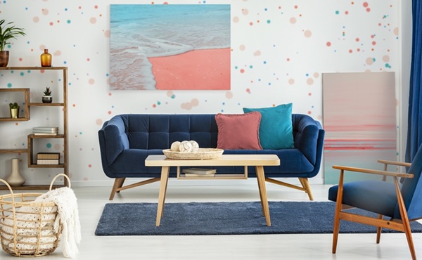
Every year in December, Pantone makes the announcement―which the entire world of fashion and design awaits―as well as all those who know that colour matters. This time the institute focused on a bold shade that is meant to remind us of the real and the authentic in a world where social media and technology set the rhythm of life.
Living Coral embraces us with warmth and nourishment to provide comfort and buoyancy in our continually shifting environment.
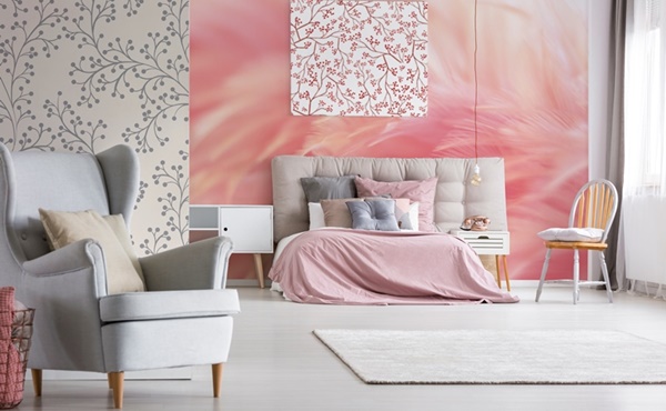
In reaction to the onslaught of digital technology and social media increasingly embedding into daily life, we are seeking authentic and immersive experiences that enable connection and intimacy.
Sociable and spirited, the engaging nature Living Coral welcomes and encourages lighthearted activity. Symbolising our innate need for optimism and joyful pursuits, Living Coral embodies our desire for playful expression.
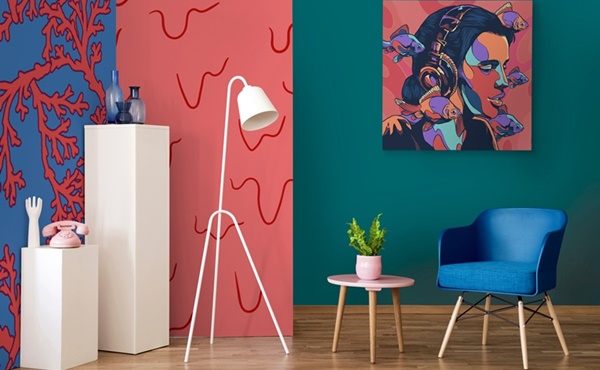
Representing the fusion of modern life, PANTONE Living Coral is a nurturing colour that appears in our natural surroundings and at the same time, displays a lively presence within social media.
“Colour is an equalising lens through which we experience our natural and digital realities and this is particularly true for Living Coral,” says Leatrice (Lee) Eiseman, executive director of the Pantone Color Institute.
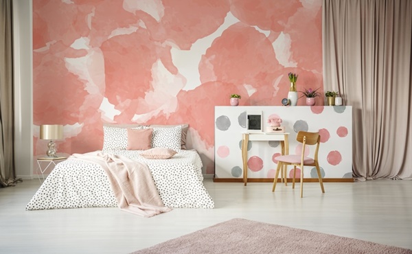
“With consumers craving human interaction and social connection, the humanising and heartening qualities displayed by the convivial Pantone Living Coral hit a responsive chord.”
The naturally occurring, flashy colour allows us to commune with the amazing nature hidden in the depths of the oceans, at the same time being close to what we see on the screens of our smartphones and computers.
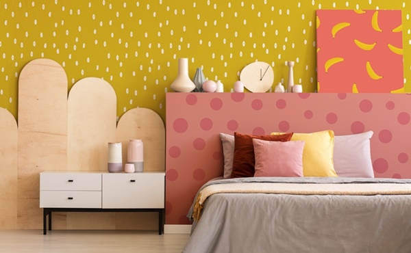
To facilitate the use of coral in everyday life―while choosing a wardrobe or interior design―Pantone has prepared five colour palettes that bring out the best in all of them. Among them, we find various combinations―from warm pastels associated with a sunset (the Shimmering Sunset palette), through psychedelic colours (Trippy), to neutral colours of the earth, warmed up by coral (Focal Point).
This vibrant and unpretentious shade will surely conquer many hearts and decorate many apartments, bringing freshness and vitality to any interior.


