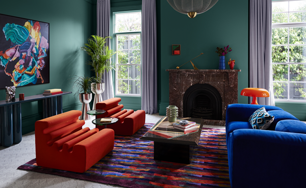
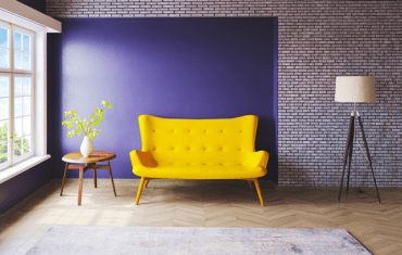
Whilst international travel is high on the agenda for many, the financial pressure from the rising cost of living has spurred a wave of entertaining at home, with Australians embracing this comfort and convenience.
The palettes for 2024 step deeper into the mid-tone colours, to evoke sentiments of warmth, nostalgia and self-expression. The colours are richer and there are less pastel and bright shades than this year, with a shift towards more sophisticated nostalgic references. Australians are becoming more confident with colour and as we continue to move away from cooler whites, we are seeing these mid-tones as increasingly popular options for consumers and designers alike.
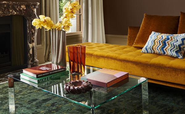
Predominant hues in the 2024 Dulux colour forecast include warm colours with a yellow influence, pink undertones that appear in clay hues and reddy browns, olive green and accents of pale blue and zesty yellow.
“There is a really important element to this year’s forecast in the way it invites colour and texture into the home,” says colour and communications manager, Andrea Lucena-Orr.
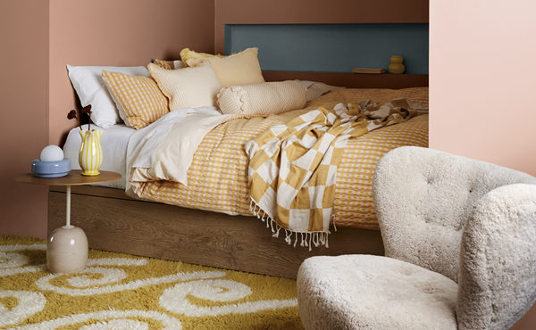
“We can see yellow and rich gold becoming more prominent in next year’s palettes. Furthermore, the zesty green and clay brown shades that we saw coming through in the 2023 colour forecast are transitioning to a warmer space, featuring yellow and subtle red undertones.
“We are seeing some lightness in colour, however, the majority of shades are mid-tone with darker shades predominantly used for small accents. The warmth we’re seeing across each of the 2024 colour forecast palettes is the answer for consumers who are looking to add positivity by adding colour in their homes.”
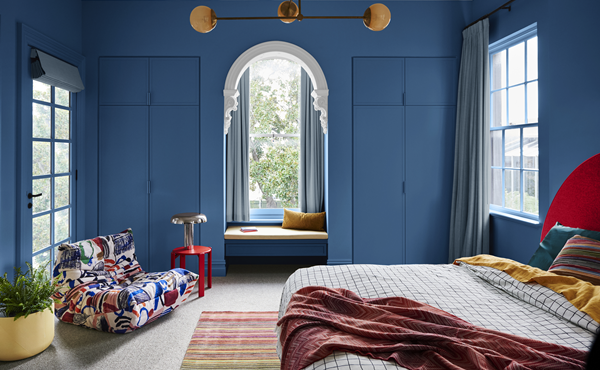
Alongside warmer palettes, colour forecaster and stylist Bree Leech, advises tactility will be another important focus for the year ahead.
“Overall, the 2024 colour forecast palettes have become more sophisticated, whilst tonal palettes are still popular and particularly comforting,” she adds.
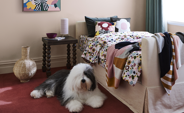
“This year we see a shift towards the use of multi-hue schemes, but crafted to reflect a balanced interior. The colours are richer and there are less pastel and bright hues, compared to what we saw in 2023 with a shift towards more sophisticated nostalgic references.”
Want to read more? Check out the full article in our summer issue.


