Looking for colour schemes that are unique enough to catch the consumer’s eye but still feel somewhat familiar and have an element of universal appeal?
Start with colours that appear most frequently in nature, says Leatrice (Lee) Eiseman, executive director of the Pantone Colour Institute.
“Nature’s crossover colours are those colours that are obvious or ubiquitous in nature, the ones that most humans have a natural positive reaction to,” says Eiseman.
“They’re what I call ‘chestnuts’…the colours that are somewhat universal in their appeal and are not so trendy that we’re going to want to change them in a few years.”
The psychological and emotional effects of nature’s colours are important to consider, she adds, but there’s even more to their appeal.
“From a purely economic standpoint, they’re more apt to have a longer shelf-life.” In other words, nature’s colours are not going to change; they’ve got staying power.
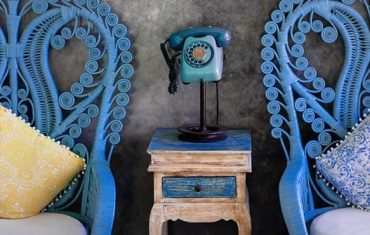
But since certain colours appear most often in nature, our eyes become accustomed to seeing them in many applications. And that’s what makes them so versatile in a wide range of colour combinations. One such example is teal, aubergine or eggplant, sunshine yellow and peach.
You can use crossover colours in different applications. One example is pale khaki, which many people tend to think of as more utilitarian. Calling it a ‘nuanced neutral’, Eiseman says applications for it range from camping gear to a classic living room chair and said khaki can have a place in the bedroom, bathroom and kitchen, as well.
What about colours options in the wake of the Covid-19 pandemic? Consumers’ buying and shopping habits might alter drastically, but Eiseman says she doesn’t see much universal change in colour preferences.
“It’s difficult to automatically change our ability to like or dislike certain colours,” she says.
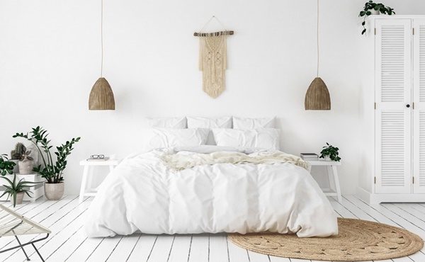
One exception is the growing popularity of white. With so many people being more conscious of sterilisation and cleanliness, “there’s more evidence of people turning to white as a refreshing, really clean colour”.
However, that trend can go both ways, she explains. Someone who currently has bold or bright home décor might opt for more whites or calmer hues in these times. On the other hand, someone who currently has a lot of white might yearn for something bolder or brighter to break up the monotony of sheltering at home.


