As the pandemic hit and lockdowns were introduced worldwide early this year, many trend forecasts had to be reviewed to make sure they were still relevant in this new normal.
For Laurie Pressman, vice president of the Pantone Colour Institute, this meant she and her team had re-evaluate their ColourWatch forecast―originally scheduled to debut at the Inspired Home Show in Chicago in March 2020―to determine which ones might resonate most with retailers and consumers in the coming year.
“Pantone believes that the industry will focus even more on innovation and transformation and that these palettes will help lift spirits and renew energies as consumers seek comfort and safety in their homes that now must serve more varied functions,” she says.
Here are the nine Pantone fashion, home + interiors colour palettes for 2021.
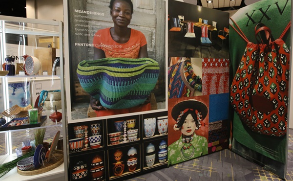
Folkloric draws upon rustic textures and speaks to the poetry of pre-tech life and long-forgotten traditions. It combines woodsy textures with the rich colours of deep-dyed yarns. It speaks to the mythic, genuine authenticity and new forms of folk art. Focus on the handmade, crafts in surface, materials, patterns and styles.
Terra Cotta reflects the natural baked earth and the need for warmth in nature essential to humankind. Its rustic inspiration is casually convivial. It relates to concern for the environment and sustainable practices. Terra Cotta embraces natural fibres, crafts and the support of local artisans. Pantone feels strongly about its popularity for 2021, because it is well grounded, as people seek warmth and the enduring values especially in these uncertain times.
Composed orchestrates a blended harmony of neutrals and pastels with cool greys or tones of darker blues. The balanced classics are timeless colours that bring us together. It’s a relaxed, comfortable palette that blurs genders with colours that appeal to males or females. The clean and simple contemporary styling is easy to live with as balance is the key message.
Vivify represents a completely different side of the palette: positivity and cheerfulness in a fresh new modernity. Since colour influences how you feel, Vivify stimulates happiness and puts a smile on your face. It conveys a youthful, upbeat spirit in sunny colours with contrasts of black and white.
As a company chooses what’s right for its product line, these colours and textures stand out from the others. The palettes aim to inspire transformation, and this one calls for originality and invites suppliers and retailers to try a new direction in product or merchandising.
Fleur recalls old world glamour and explores past luxuries. A more formal palette, or in an outdated term, ‘upstairs’ styling, Fleur looks to new romance, passion and intimacy. It combines lush reds, deep rose tones, a touch of gold and accents in dark polished forest greens. Even though today consumers are living in more leisurely clothes, this palette looks ahead to a time when they will dress up again for elegant events.
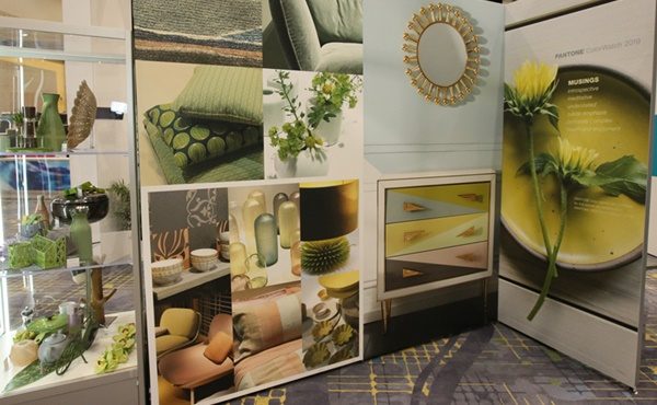
Synergy is immersed in nature—peaceful, quiet and harmonious. Its nurturing, healing heartbeat includes soft colours in moderation from yellow greens to blue greens. Synergy expresses collaboration and a minimalist inspiration, yet can allow some drama, as nature does. Think spa colours and an atmosphere that inspires you to take a deep breath and calm down.
Quixotic speaks of multi-cultural influences of art and fashion. A new sophistication based on adventurous tonal combinations, Quixotic appeals to intrigue and complexity with strong orange-toned reds with blues and black accents in jagged patterns and quirky splashes.
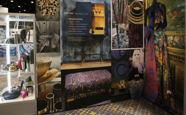
Polychrome is a complex palette with novel combinations of similar colours. It draws from global historic architecture with intricate patterning and details. This palette challenges merchandisers to be original and bold in contrasting colours to create the mood for consumers. Mix up the products to reveal the textures in wood, ceramic, glass, fabrics and plastics in shapes that can be sleek and curved or angular and jagged. Products in purple, pink, mustard yellows and rust browns are accented with soft blue tones.
Galaxy looks to the stars. Our fascination with orbiting in outer space, light and technology is expressed in metallic finishes and blends. Galactic inspiration appears in dramatic contrasts of light and dark—gold, silver, blues and purples as stars streak across the dark skies. Glistening products in shiny finishes and icy colours sparkled.
“After Covid-19 hit, we reviewed the palettes to re-evaluate what was changing and what we felt comfortable with for trends that are likely to move forward,” Pressman explains.
“We felt most challenged with Fleur, the more dressy, elegant palette, but some products lend themselves to that mood. Vivify’s bright and vibrant colours to the warm and meditative shades of Folkoric we think remain valid for the longer term.”


