The colours used in both marketing and merchandising can have a huge impact on the consumer appeal of your products and new research has revealed the best colours to use to give you a head start.
While colour preferences vary greatly depending on the demographic of consumers, red is by far the most popular colour for retailers when merchandising, the research from 99designs, which analysed 600 graphic design projects across the retail industry, found.
Blue, black and white were other favourites for retailers while brown, purple and pink were the most uncommon choices. But the right hue for a retailer will vary greatly depending on the diverse business ethos of retailers, the research says.
Either way, colour is a critical component of a brand’s overall marketing strategy and should be used selectively depending on the message a retailer wants to convey to consumers, says the report.
“A quick glance at your logo, website or in-store decor can tell a shopper what style, price range and personality your products offer just by what colours are prominent. In retail, colour choice is more than just aesthetic—the right colours can actually help you close a sale,” the research says.
Pamela Webber, chief operating officer at 99designs says that choice of colours in merchandising is proven to have a significant impact on consumer purchasing decisions, with red a proven favourite.
“It’s hardly a coincidence that nearly every retailer uses red on their sale signage,” she explains. “Red is universally accepted to signal excitement and passion, which is a good thing when you’re looking to shift large volumes of product or merchandise.
“Blue and red are the most frequently requested colours by 99designs retail clients, while black and white were the most prevalent accent colours, appearing in 40 per cent of the logos analysed. Across the industry as a whole (not just among 99designs clients), red is the clear favourite with 59 per cent of the largest retail brands such as Target, Spotlight and Cotton On opting to use red as their primary logo colour.”
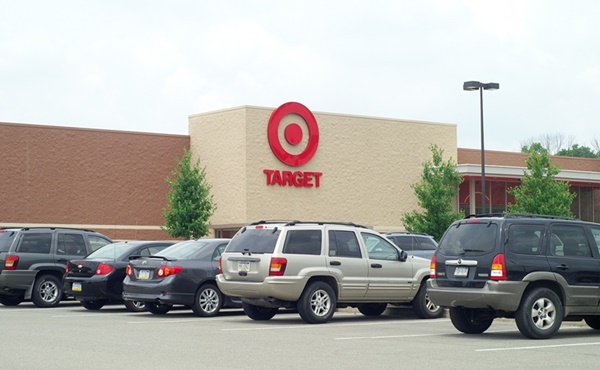
Red was also by far the most popular colour for retail leaders, comprising 59 per cent of the retail stores colour and logo―with Mac, Target and GNC leading examples.
Although the best colour to use will depend on the message the retailer wants to convey, these choices should be made with great thought given their impact on purchasing decisions, says Webber.
“Academic research has shown that purchasing intent is greatly affected by how a brand is perceived visually, so colour choice can have a real impact on sales. However, colour psychology is an inexact science, so ultimately a colour’s impact on sales will always depend on a retailer’s particular customer demographic and audience, as well as how they use a particular shade in their branding. ”
For smaller retailers, thinking outside the box is critical if they want to stand out, adds Webber.
“Be strategic in your colour choices and think outside the box. While red, blue, black and white are the most popular choices industry-wide, for smaller, niche retail brands, standing out is critical. Just because brown, purple and pink aren’t particularly popular colours when it comes to retail branding, they might be perfect for your candy store and target demographic, so don’t be scared to break the rules.
“Even an unpopular colour like brown—which has the weakest association to the ‘youthfulness’ so desired by the retail industry in its creative briefs—can still have its moment depending on your product and customers.”
Why these colours work
The report analysed why the various colour choices of some of the big name brands are effective.
Target, for instance, uses red as it caters for younger shoppers—or at least those who want to feel younger.
While not as popular across the States, budget supermarket Aldi combine the intensity of warm colours like red and orange with blue, explains Webber. Blue is the dominant colour to the general population, but highlights of red, orange and yellow around the frame give it a more powerful presence without going as bold as Target. The use of gradients, which came as part of Aldi’s rebrand in 2017, modernises the brand while remaining recognisable.
The paper offers a blueprint for determining the best colours for your brand and a tool to determine the best colour for your brand based on its individual attributes. The tool can be found here.
By Georgia Clark
This article first appeared on retailbiz


