Consumer perceptions of colour are always changing and according to colour expert and executive director of the Pantone Colour Institute, Lee Eiseman, there are fewer hard-fast rules surrounding colour harmony than in the past.
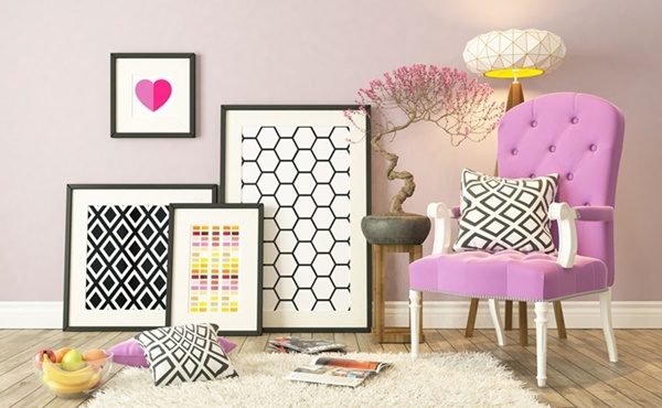
“Once thought of as only ‘Barbie dolls and bubble gum’, pinks―and hot pink in particular―have made gains as a symbol of feminine respect and clout,” she says, explaining some of the most notable changes in consumers’ perceptions of colours today.
“Also, what used to have a negative connotation of dirt or being dirty, brown now conveys richness, whether in terms of nutrient-rich soil or flavour-rich coffee. Brown was featured on the spring runways this year.”
In today’s society we have to think about colour in a different way, she says. There are some givens that will always remain the same, but there are other things to be learned.
“The goal of colour harmony is to provide visual appeal and a sense of order that results in a dynamic equilibrium that helps engage the consumer and gets them pulled into your product,” she explains.
“There are times in today’s marketplace where a sense of disorder is actually embraced. Power-clashing―the newest buzzword in colour―is extremely popular these days and is especially effective when there is a sense of irreverence or whimsy that you want to convey.”
While come colours traditionally have been viewed as warm or cold and you would never combine them, Eiseman says there are many ways to adjust them and actually use these colours together in the same palette.
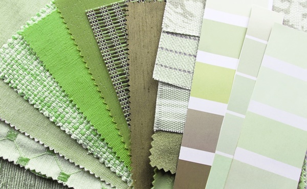
For example, incorporating greens and purples is a great way to link cool and warm colours, especially as they are very popular at the moment (ultra violet is the pantone colour of this year while greenery was last year’s favourite).
“Whether we’re thirsting for an object of beauty or we’re simply thirsty, there’s no denying that an inherent fascination for colour and colour effects is deeply embedded in the human psyche.
“As part of our psychological development, colour is unquestionably tied to our emotions and our intellect. Every colour has meaning that we inherently sense or have learned about through association and/or conditioning.”

Eiseman also explains that the proportion of colour used is important to consider. “Since colour is rarely used in isolation, the most successful combinations are those that use the most common visual cue in the right kind of proportion to elicit a response.”
By Marion Gerritsen


